A graphic design classic serving over five decades
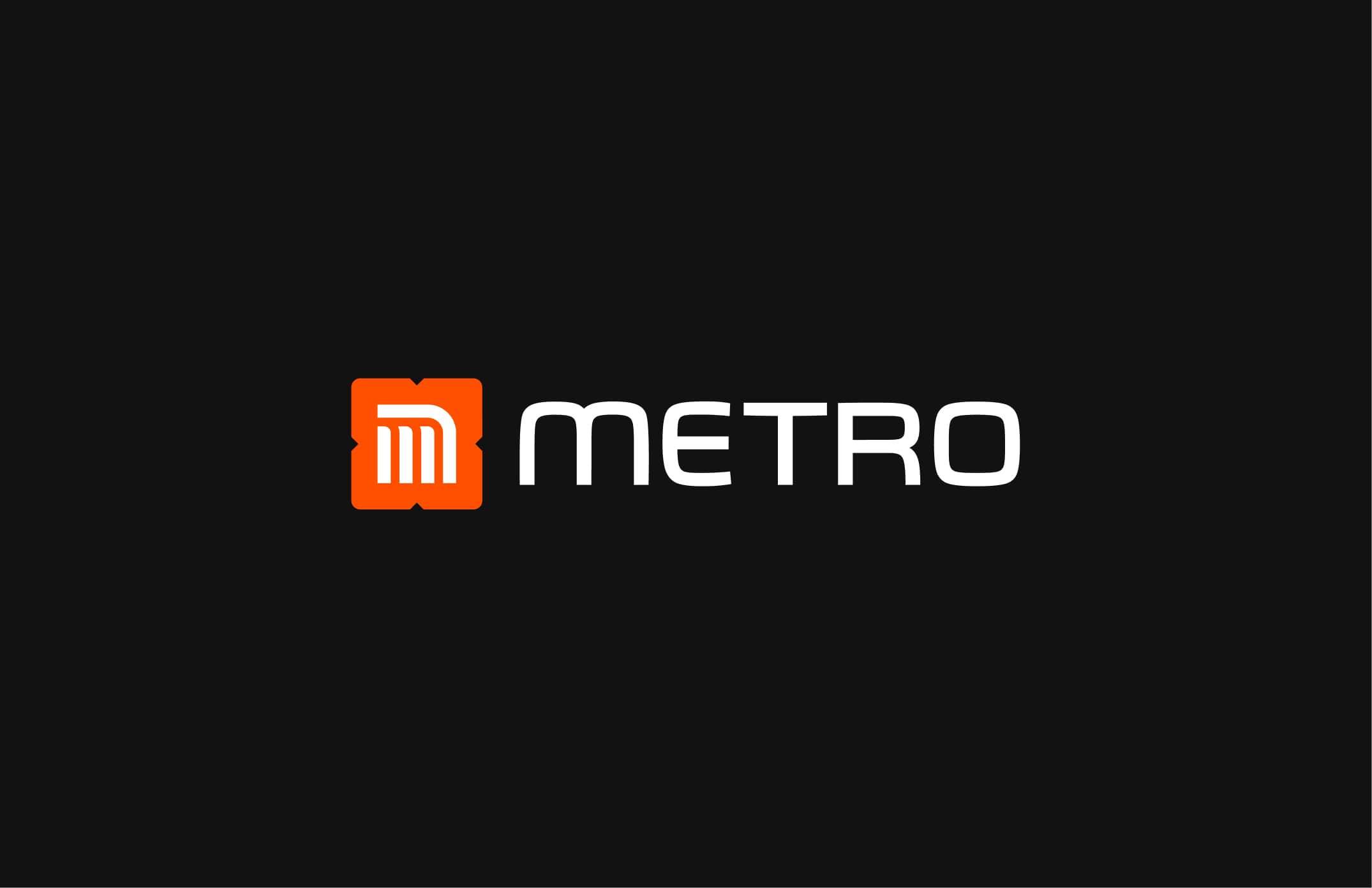
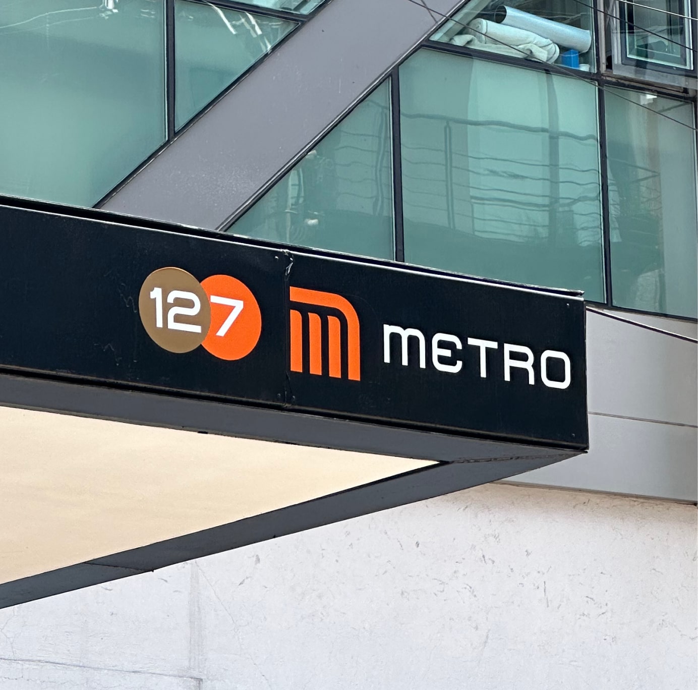
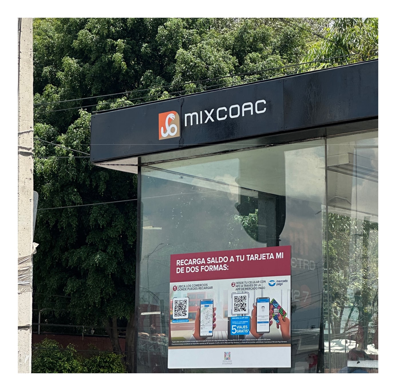
The "Metro CDMX" identity was developed by Lance Wyman, Arturo Quiñónez, and Francisco Gallardo for the Mexico City Subway in the 1970s. Over the last five decades, their work has influenced the way Mexicans move across the city and it's today one of the most iconic graphic design works. But In the same period, the brand has been evolving and expanding in a not very consistent way affecting different transports and multiple places where some of the elements are applied. The typography, colors, and iconographics find it difficult to maintain that consistency and overall to work well and serve new needs for example new technologies required.
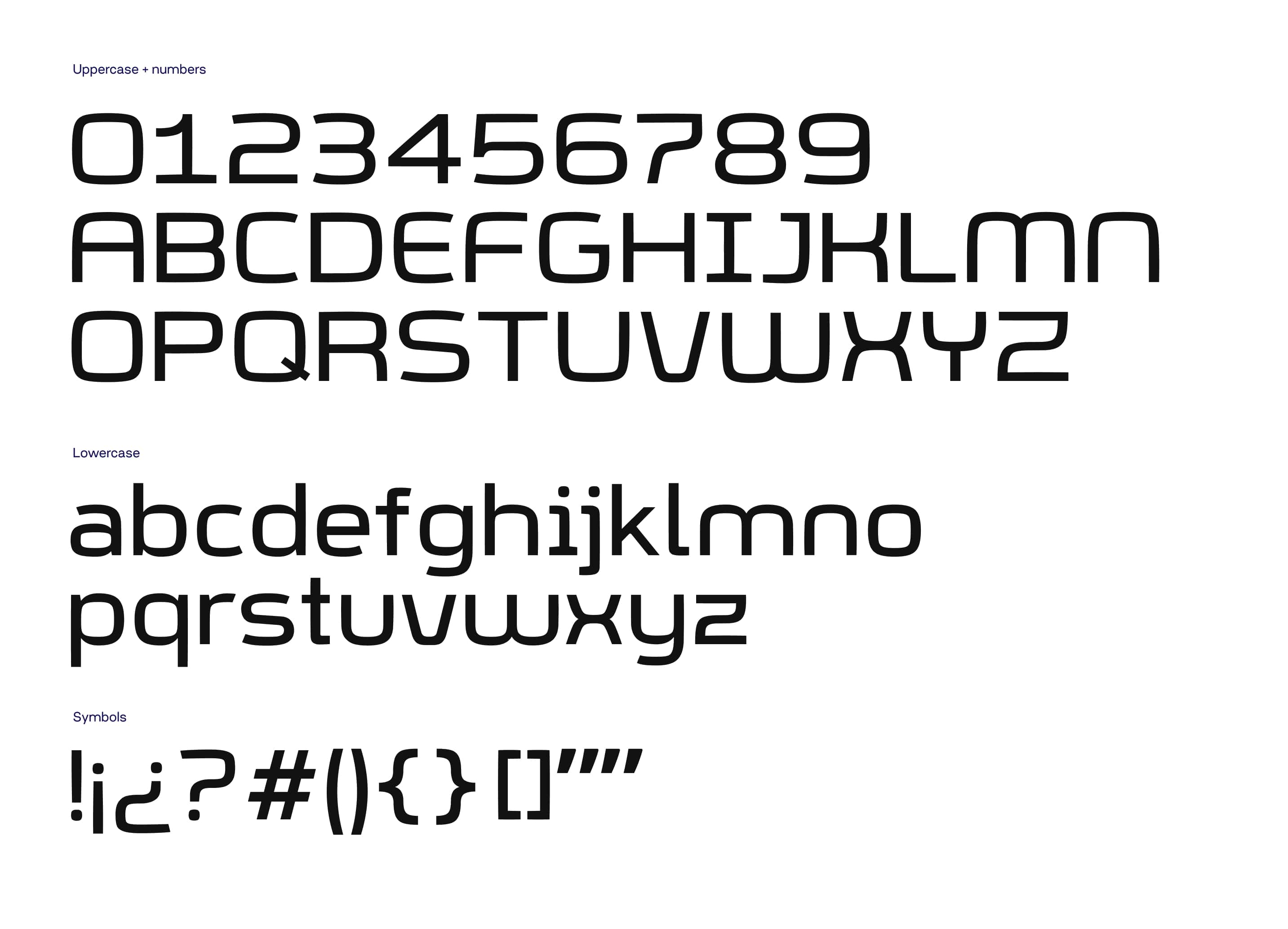
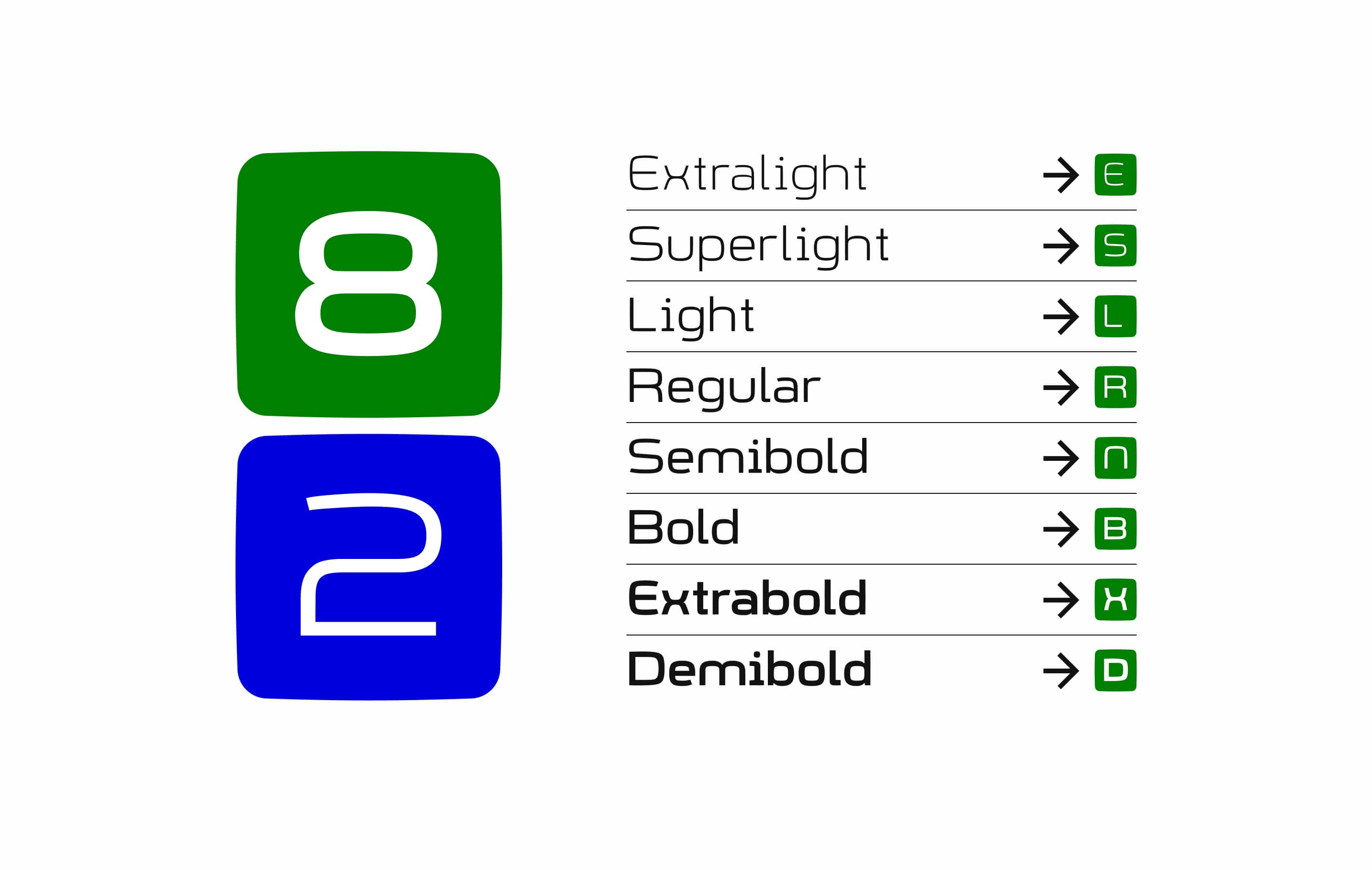
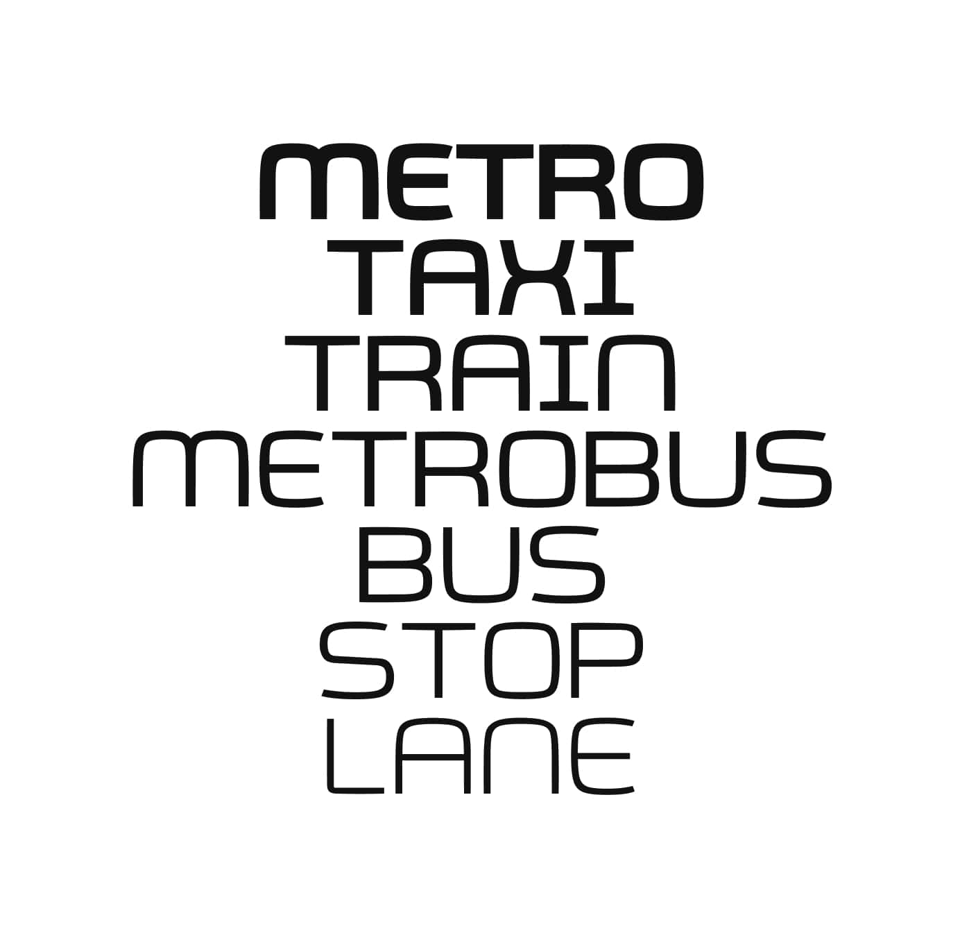
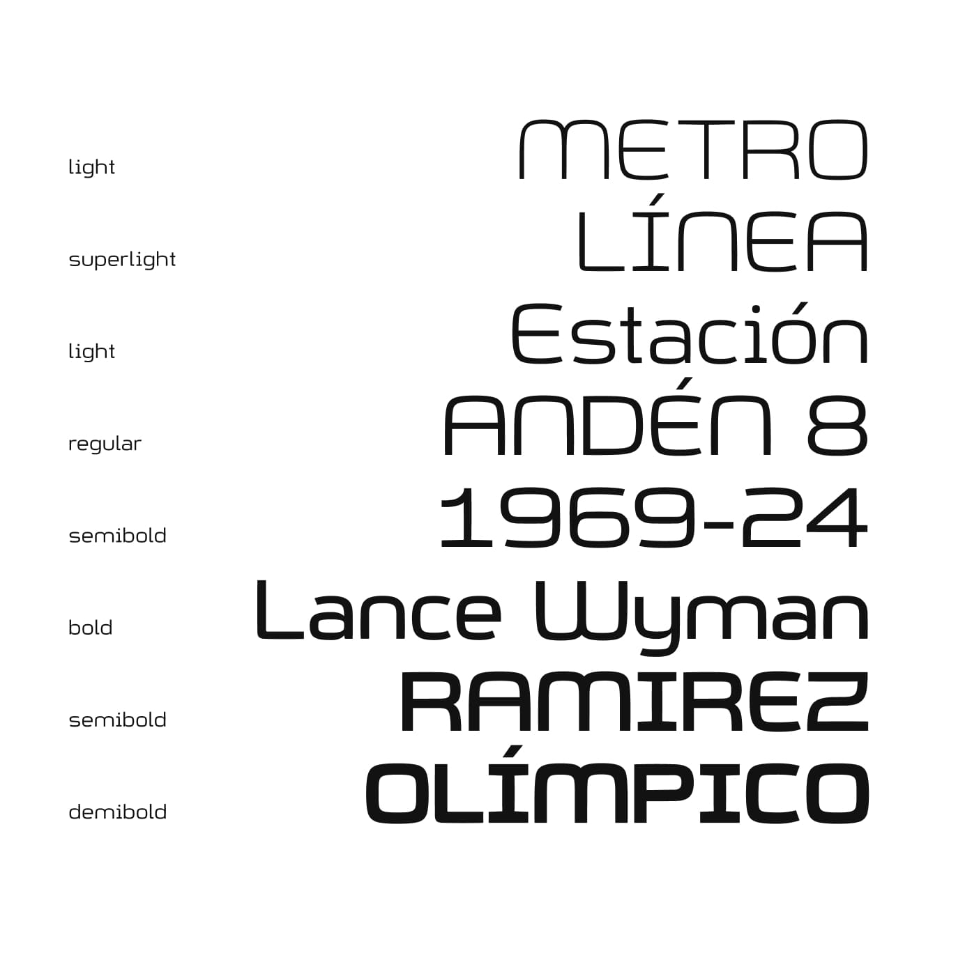
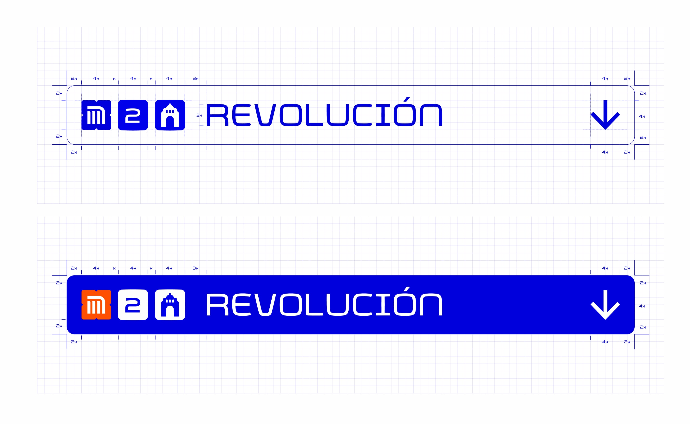
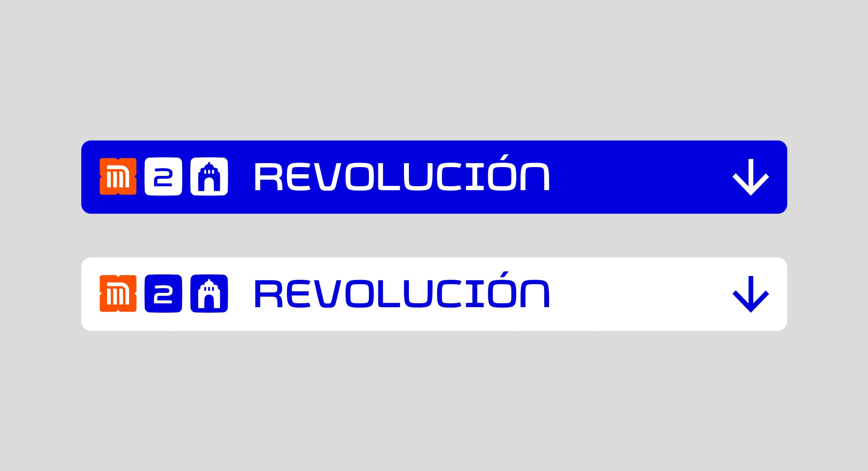
Improving the classic Metro Typography
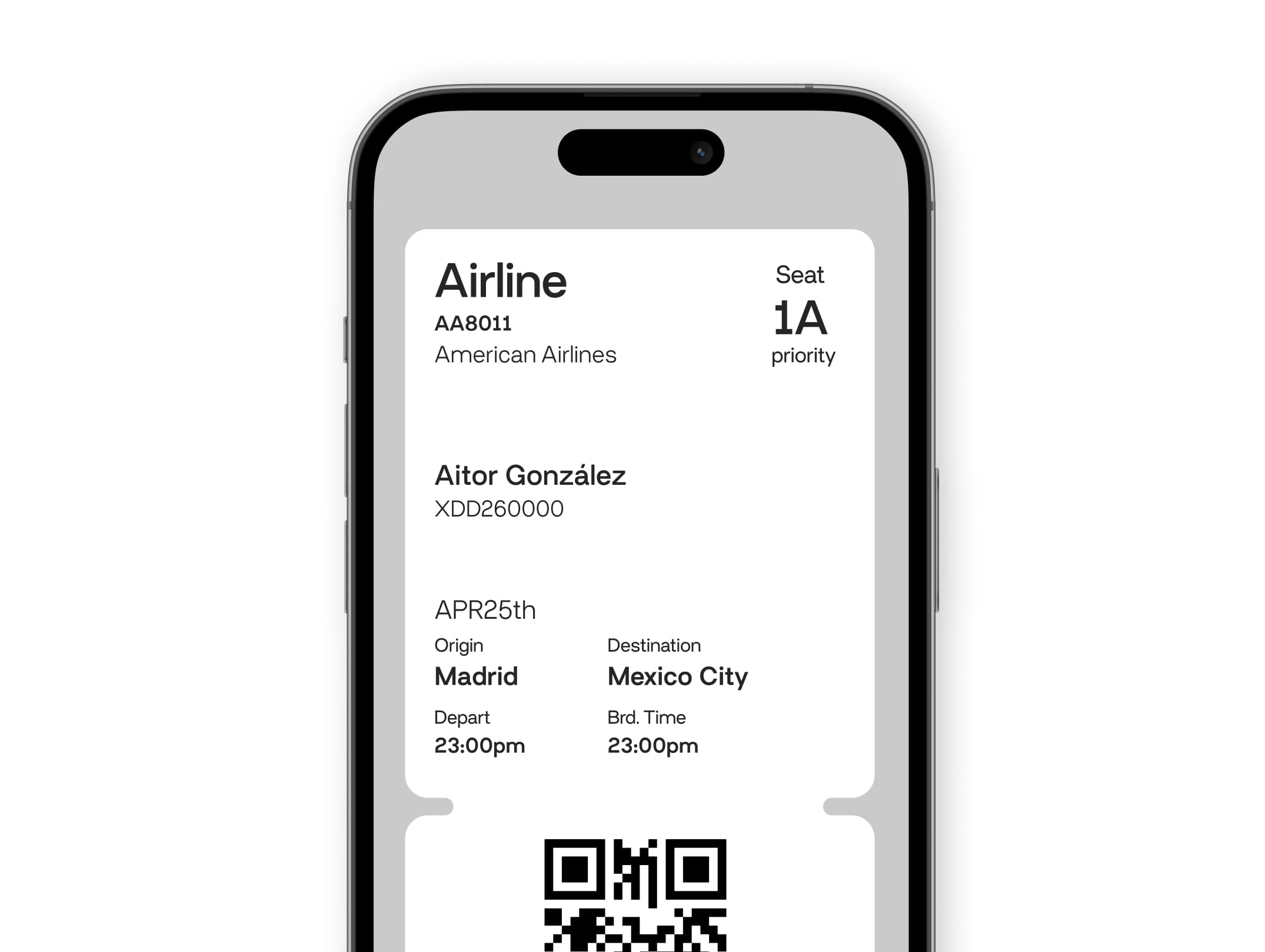
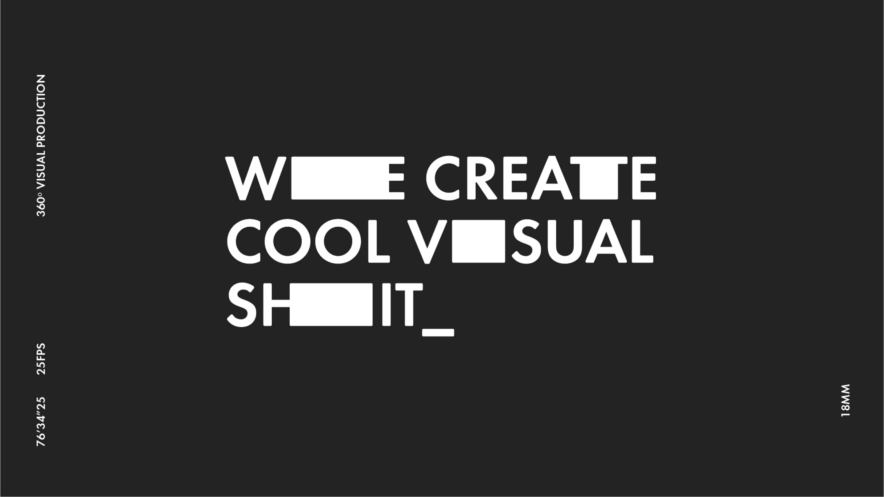
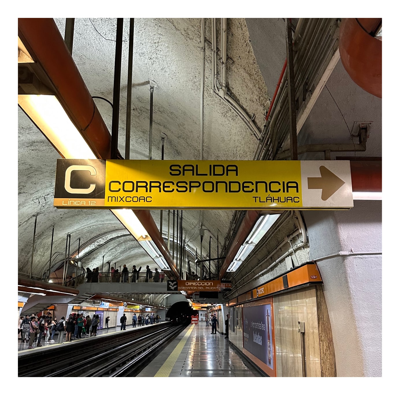
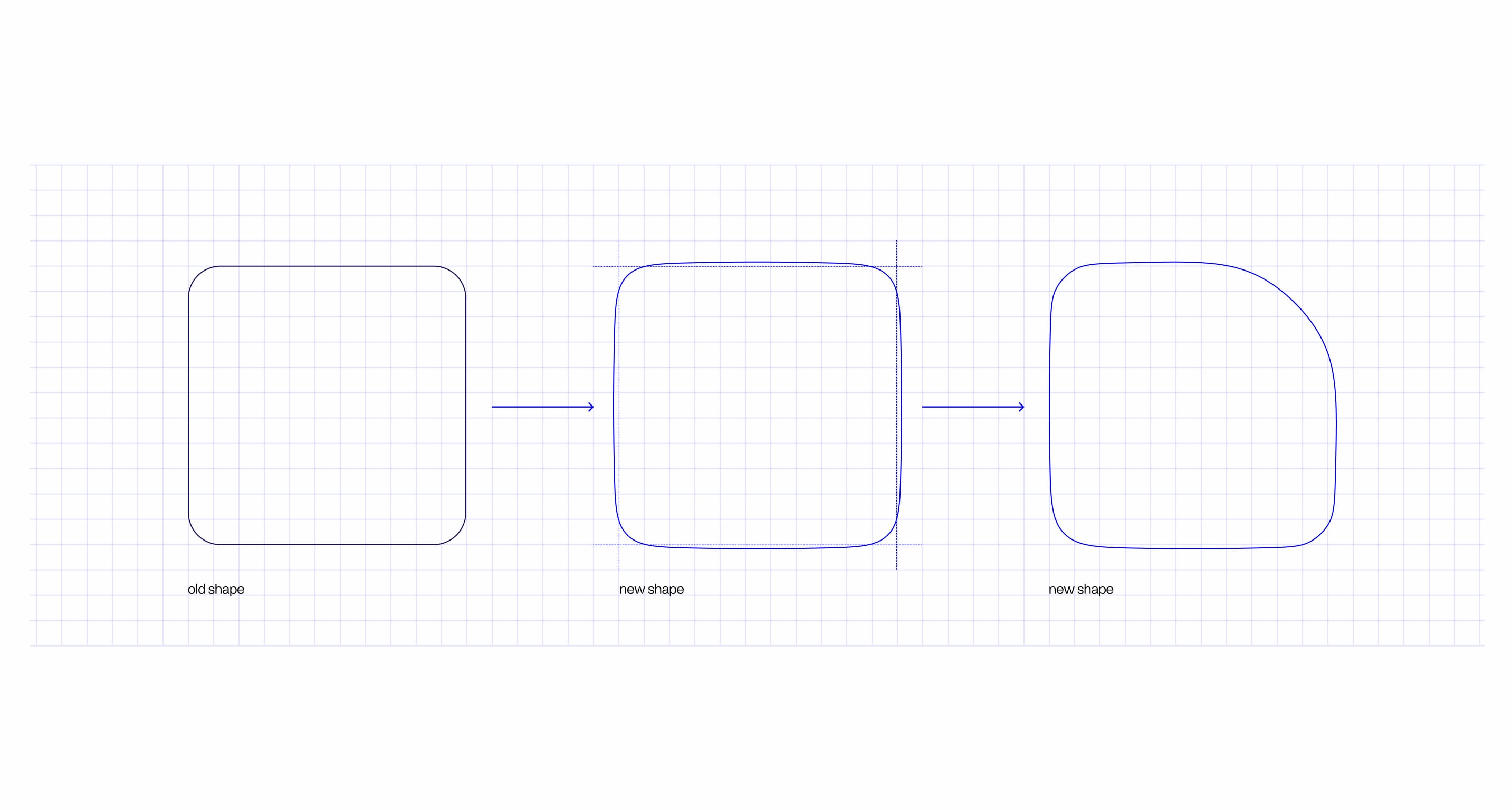
For decades Metro, the typography created by the designers for the Mexico City Subway has dominated and provided an iconic design character to the city's transport. This new proposal I presented before this project, pretends to evolve this classic and expand some elements the original proposal probably needs after so many years of service.
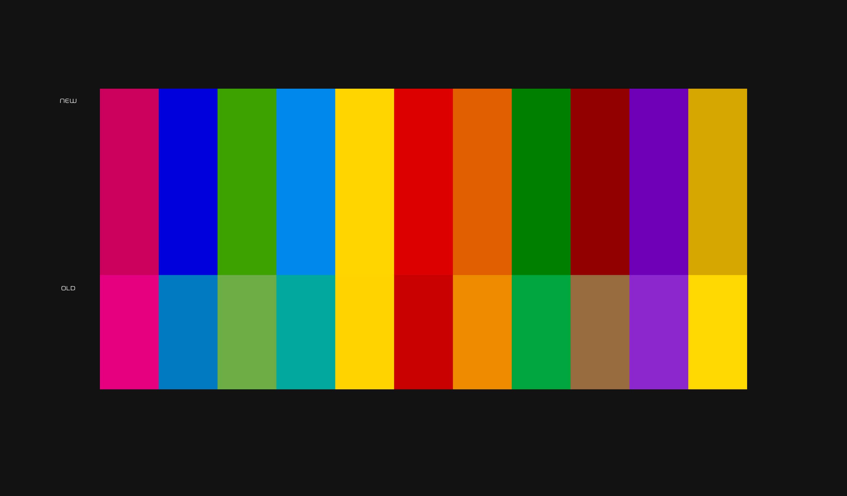
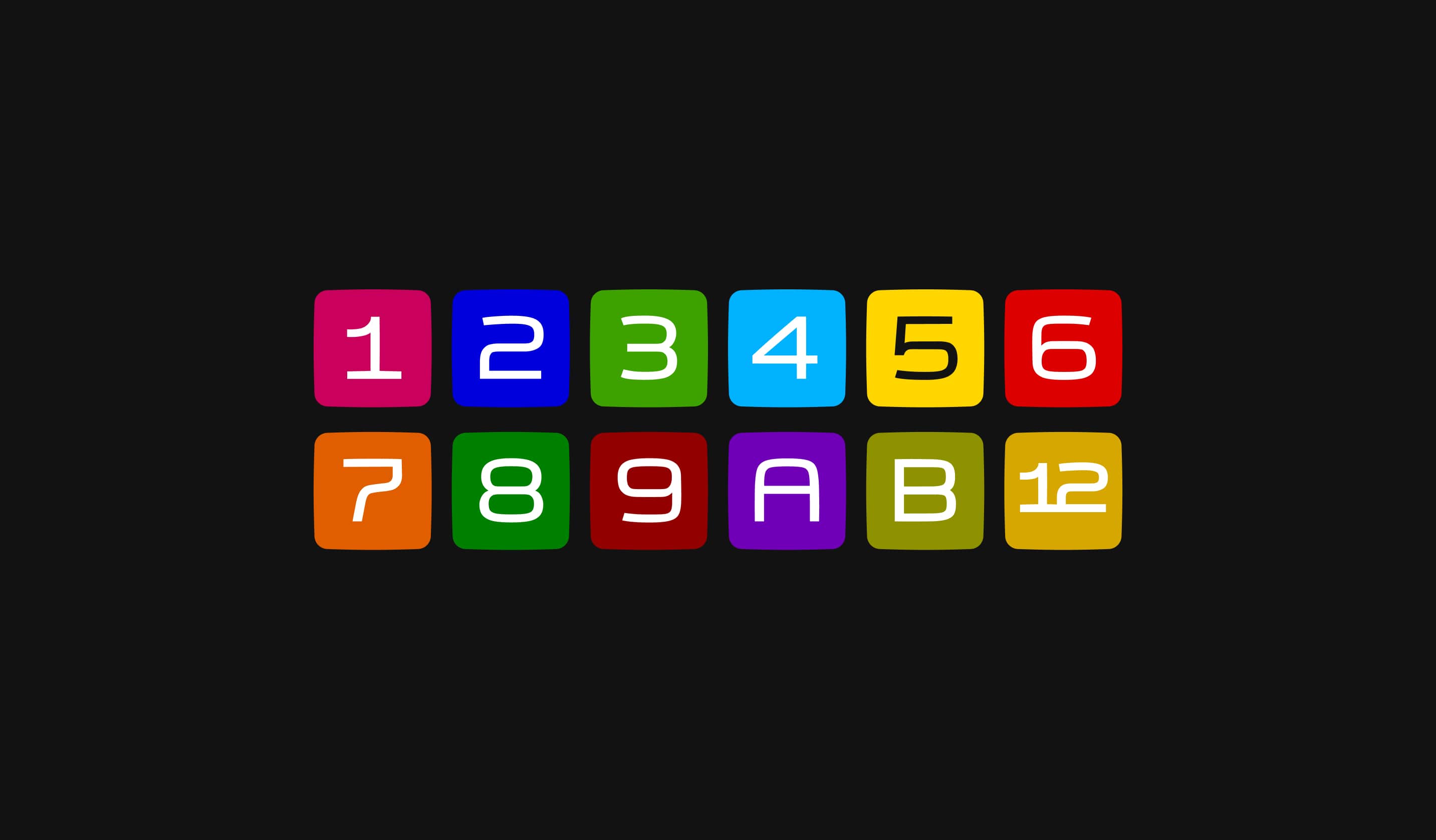
Color: Improving accessibility
It was time. The color palette was created originally in 1969. The original lines system was created for the three original lines opened. After all that time, the transport system has been amplified to twelve lines and the brand identity system works for additional transport systems like Metrobus making more complex the use of the colors. Additionally, most of the colors presented deficiencies in accessibility contrast making it a little bit more difficult for this palette to work efficiently on digital devices and for people with accessibility requirements.
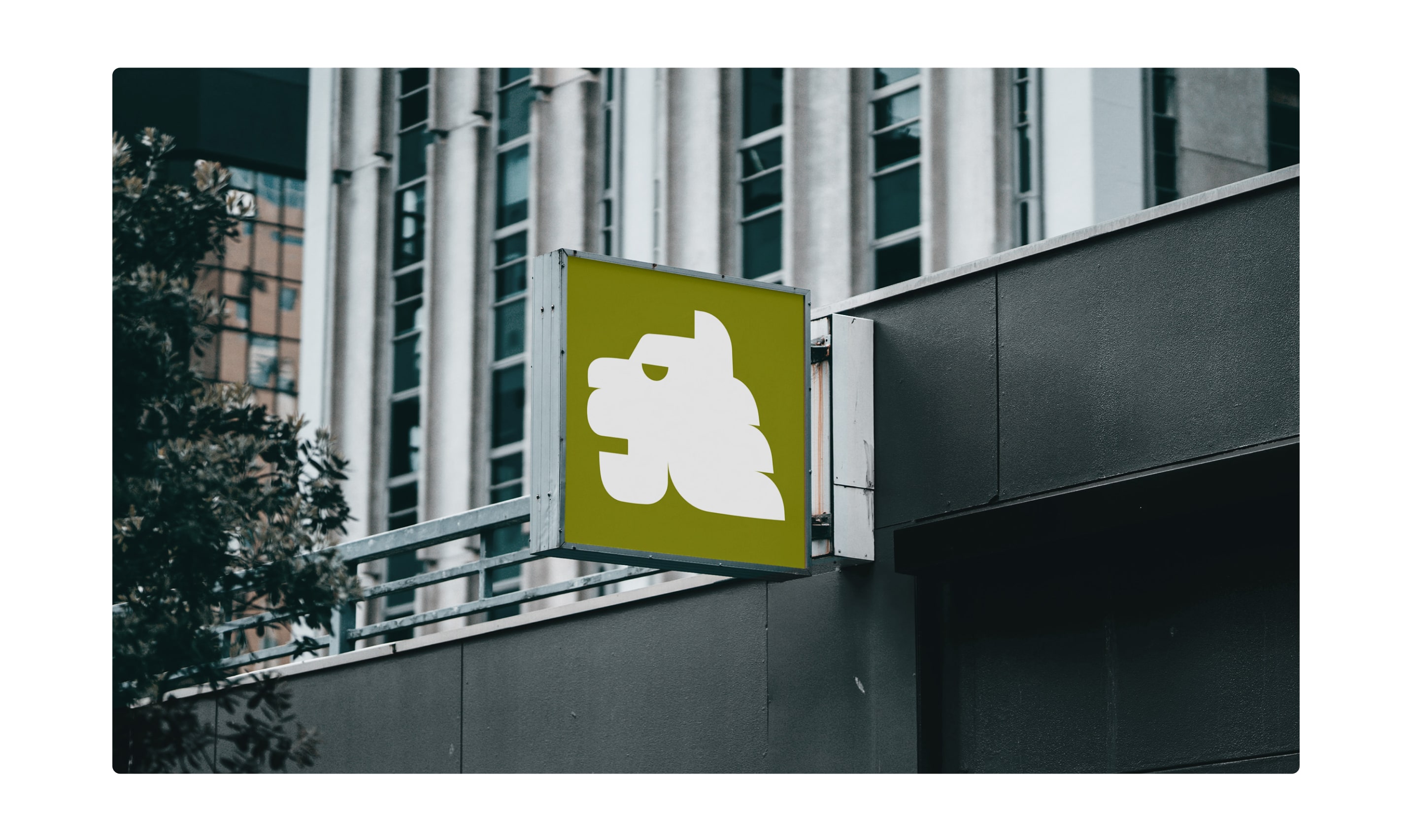
Redesigning the classic and iconic typography
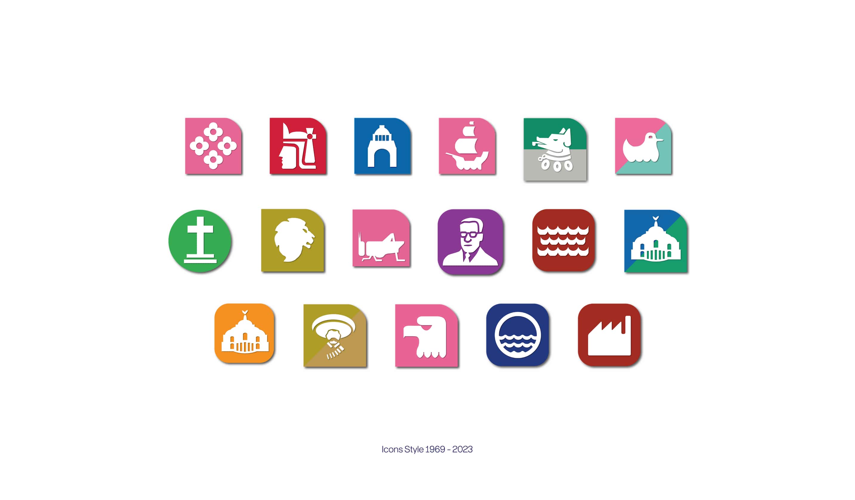
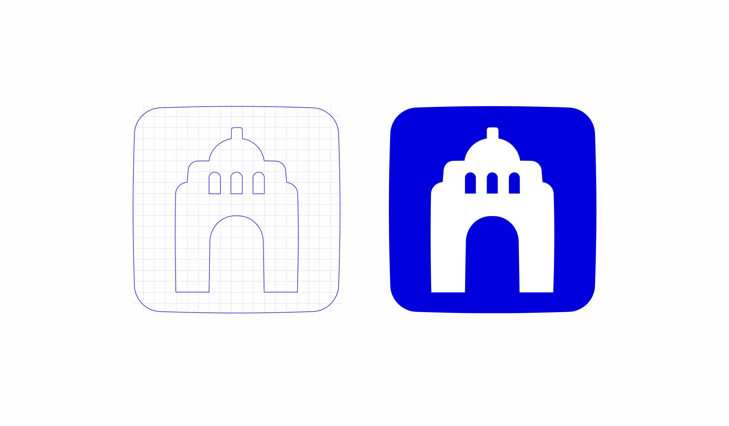
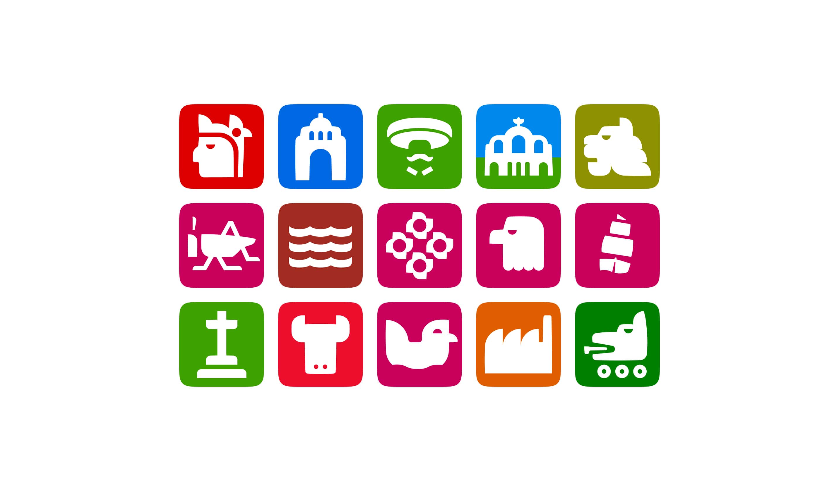
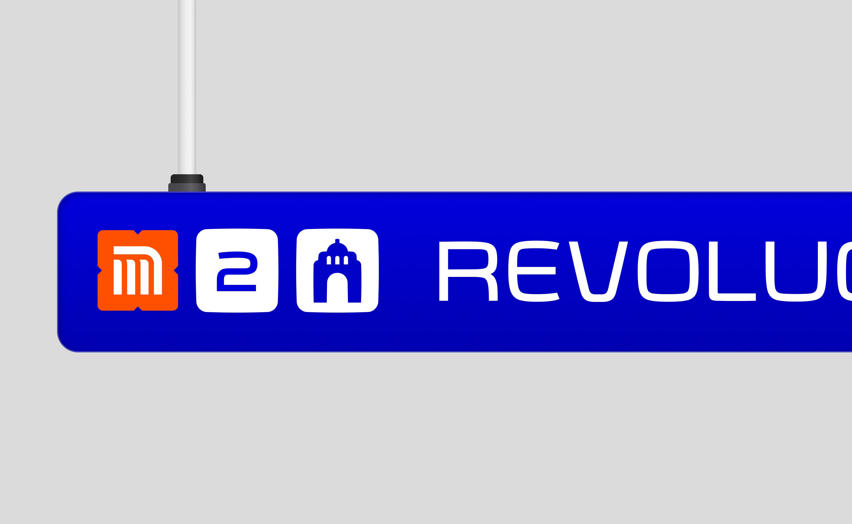
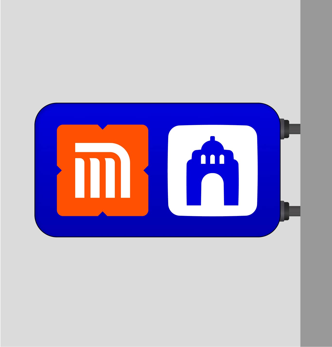
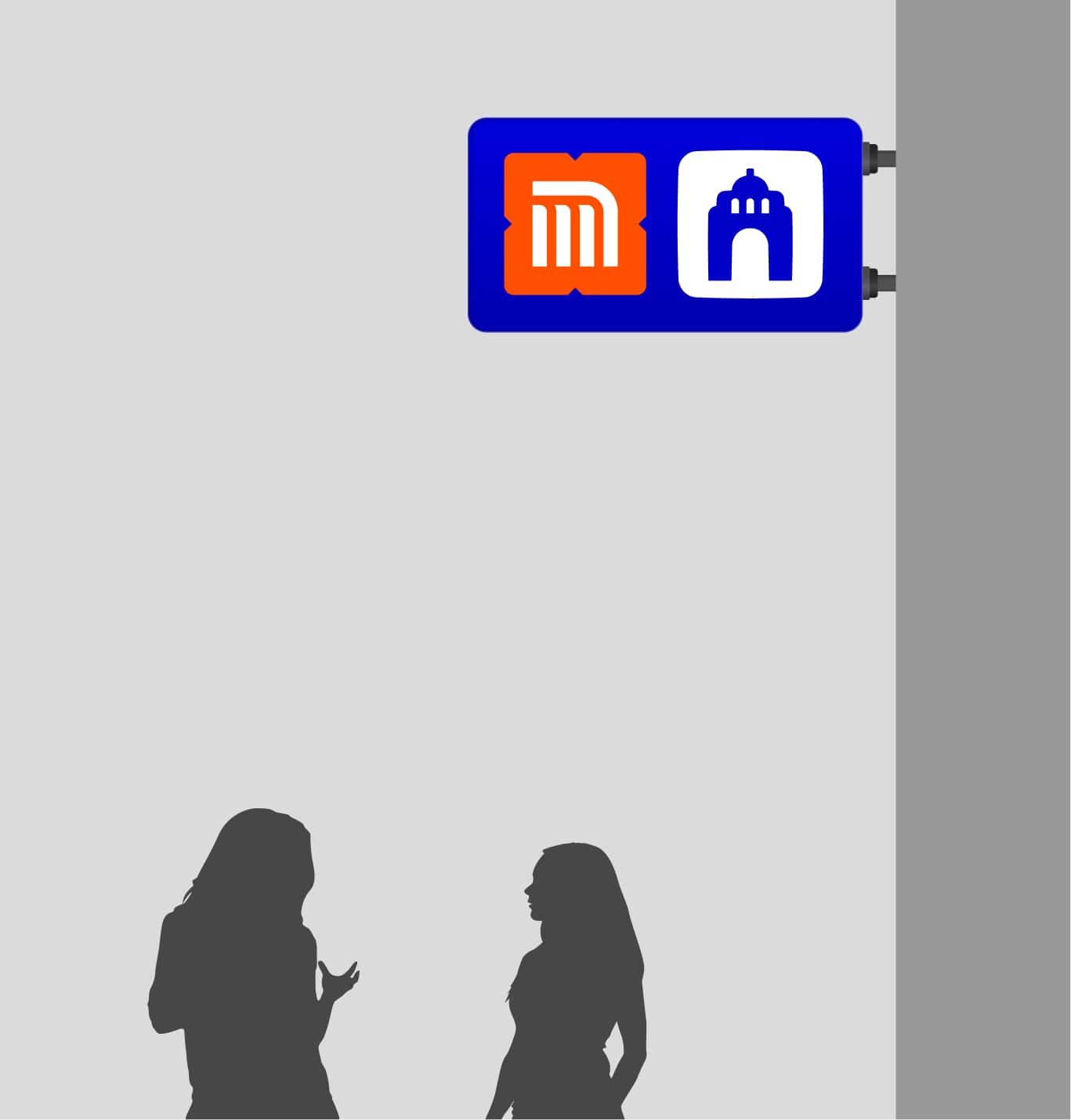
For decades, along the Metro icons created by Lance Wymann, Arturo Quiñonez, and Francisco Gallardo served as a unique way to help Mexicans use the transport. Created as an identification method able to help people unable to read they all became a classic and worldwide recognizable graphic design work. After decades, the icon system has become bigger and contains hundreds of new icons with different styles.
As expected Connecting this exercise connects with the form of the typography and tries to define a new system of rules to create consistency across all of them. In addition, I worked on making these rules work for general wayfinding icons.


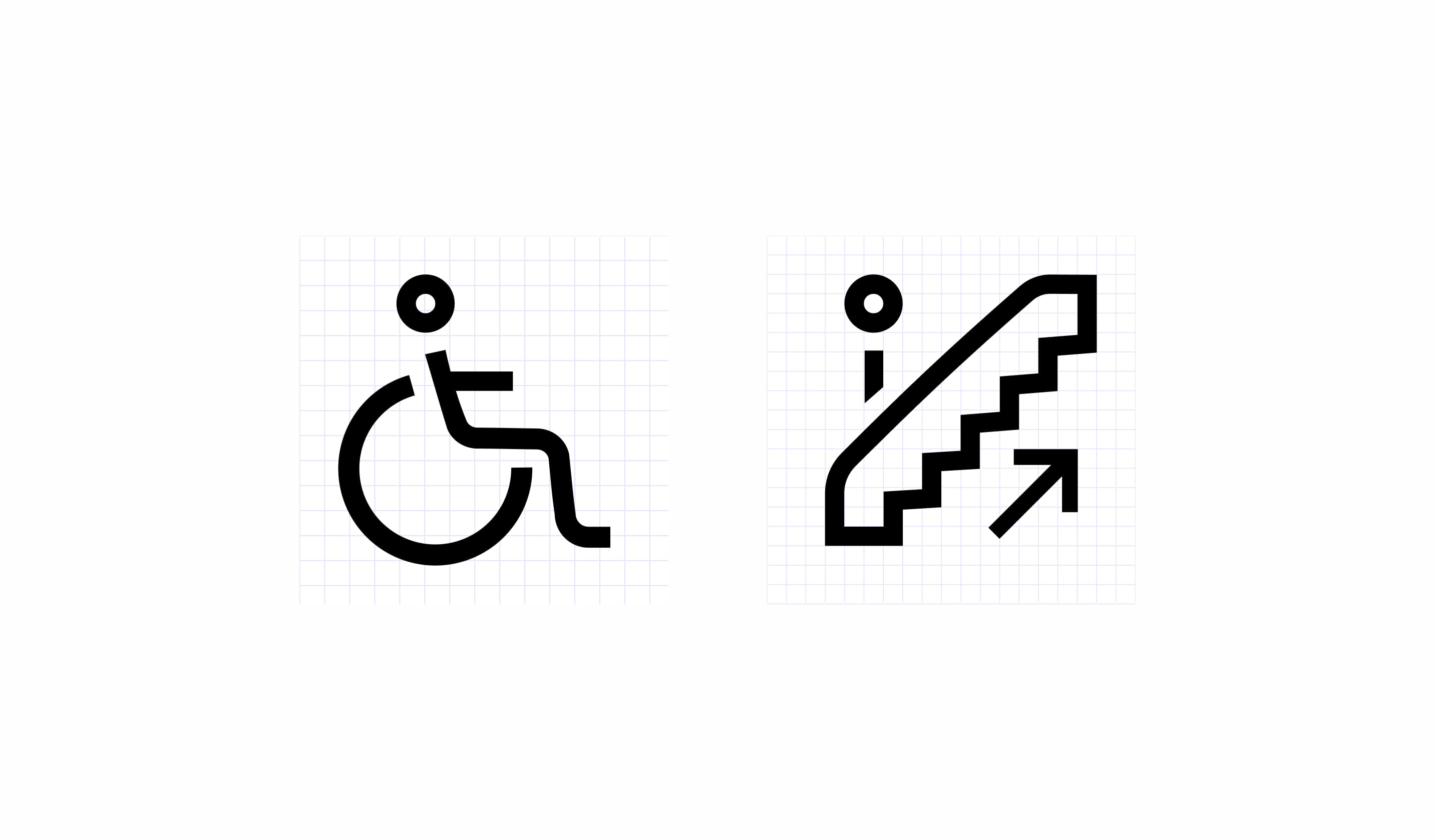
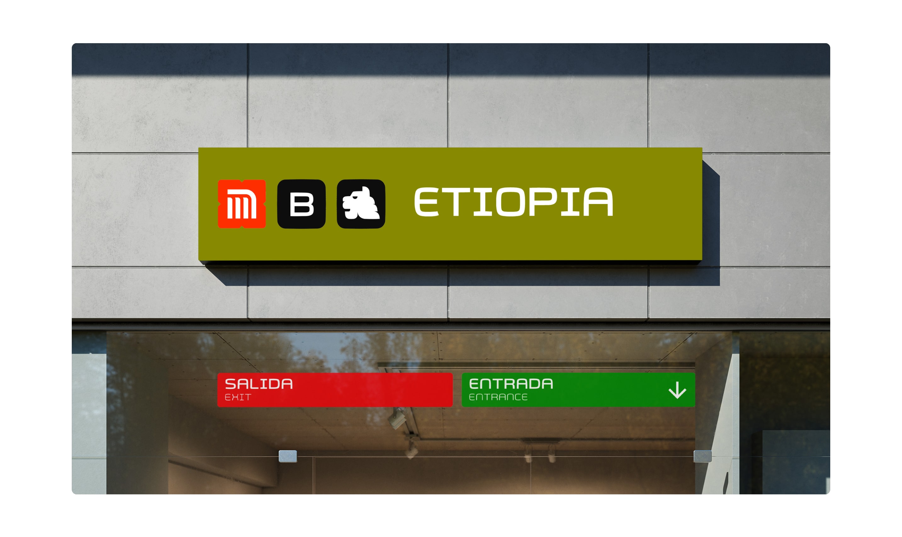
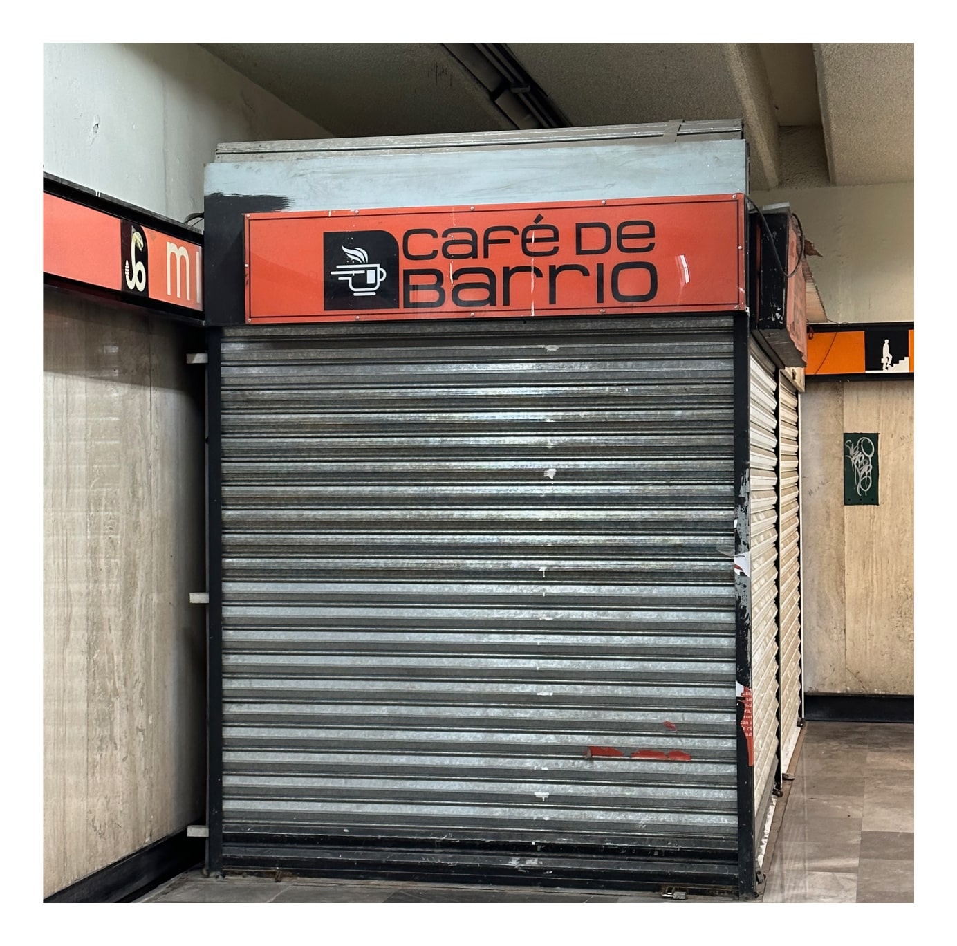
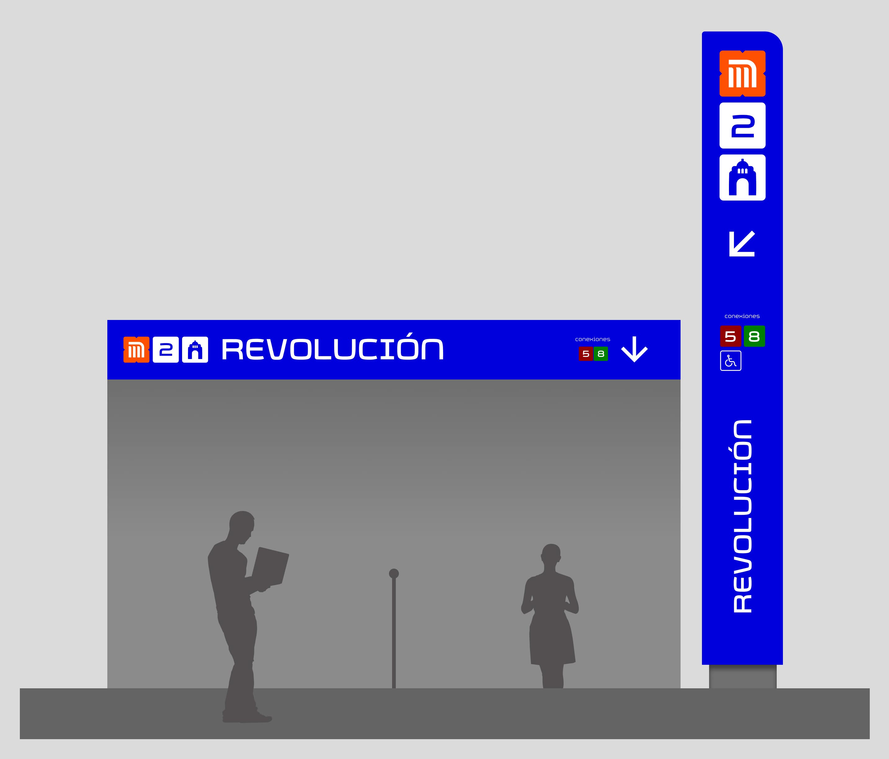
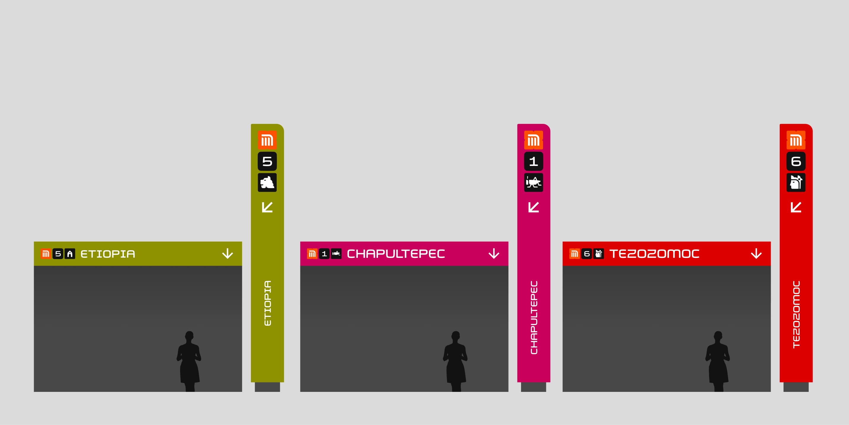
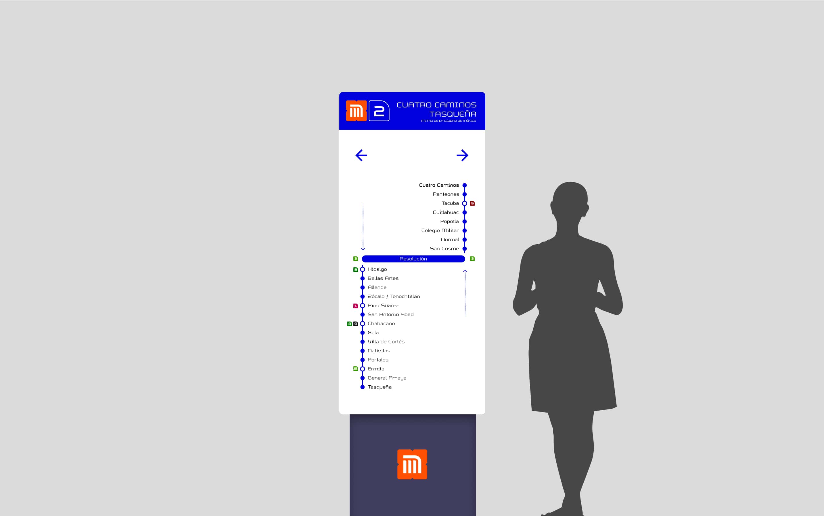
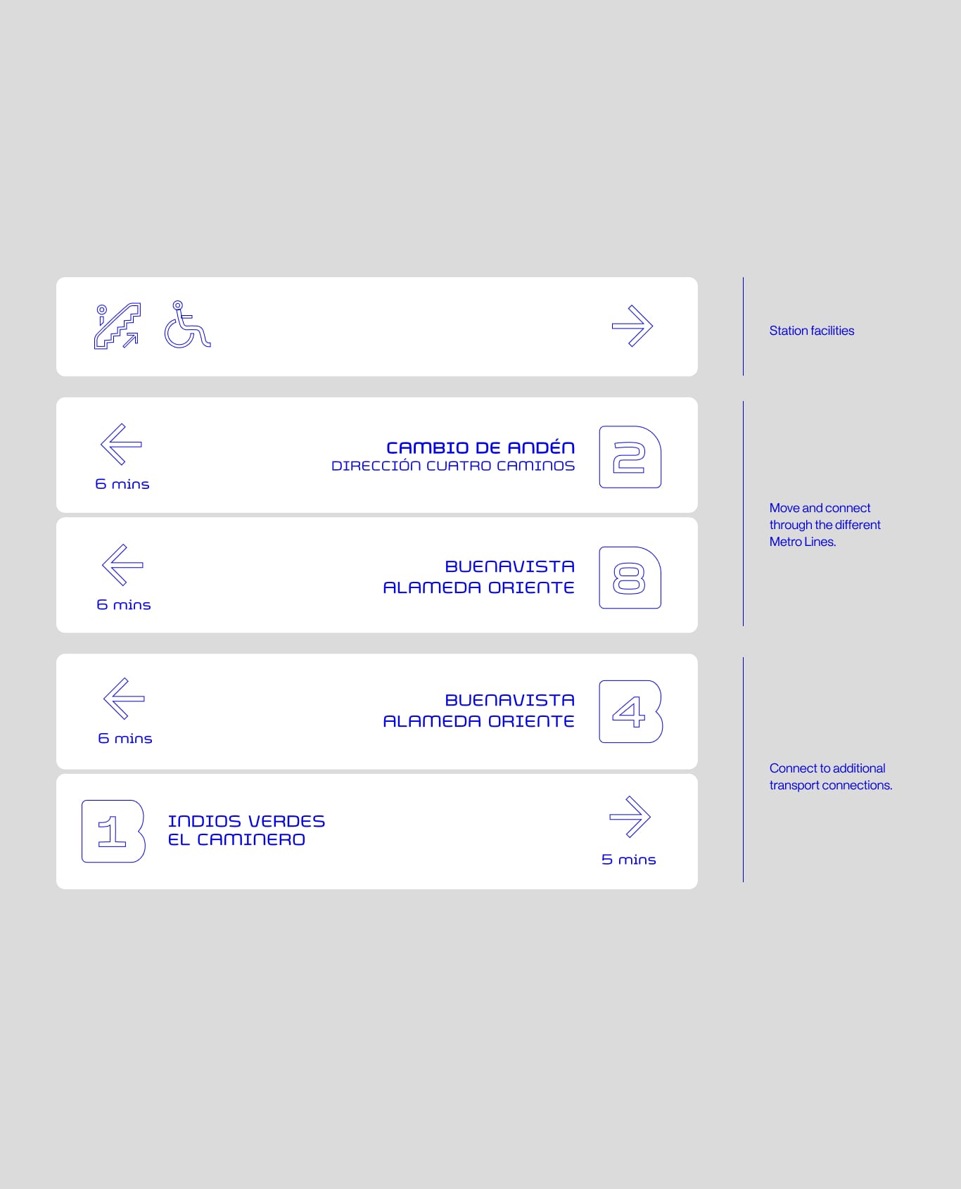
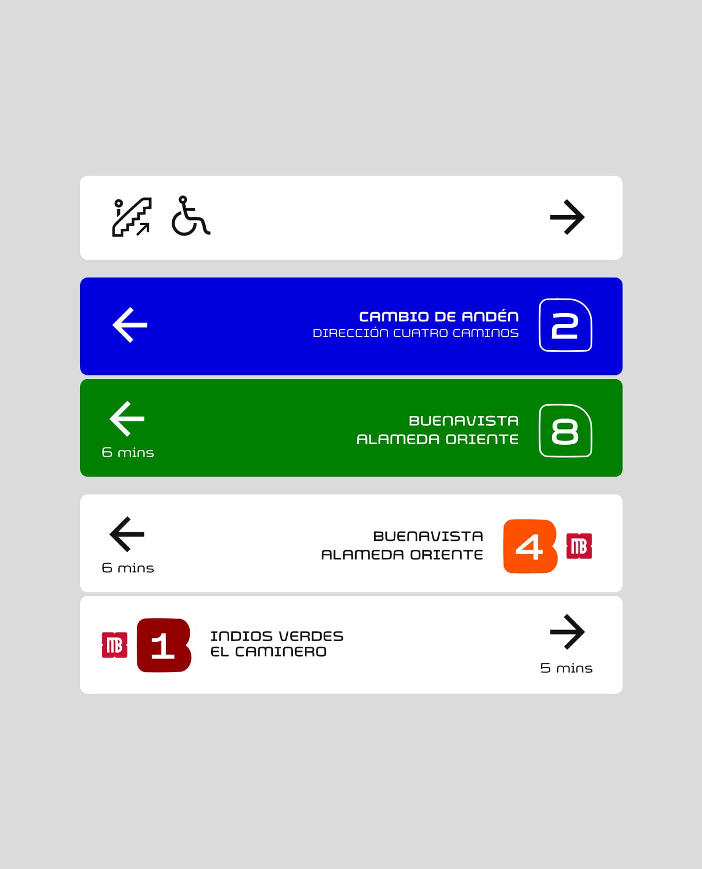
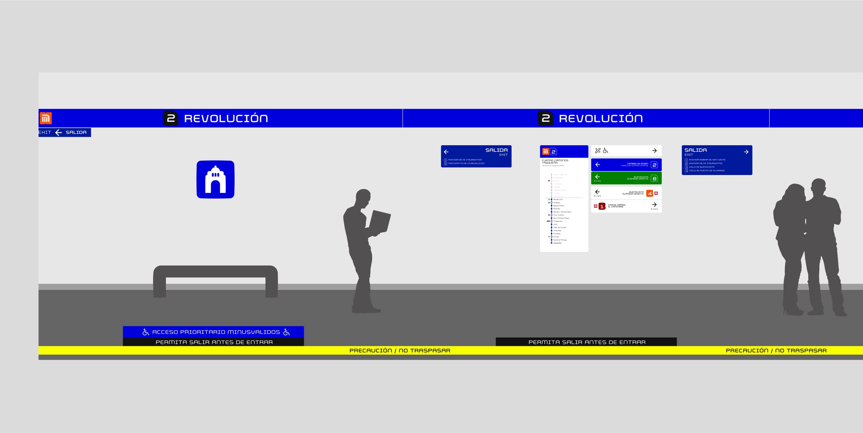
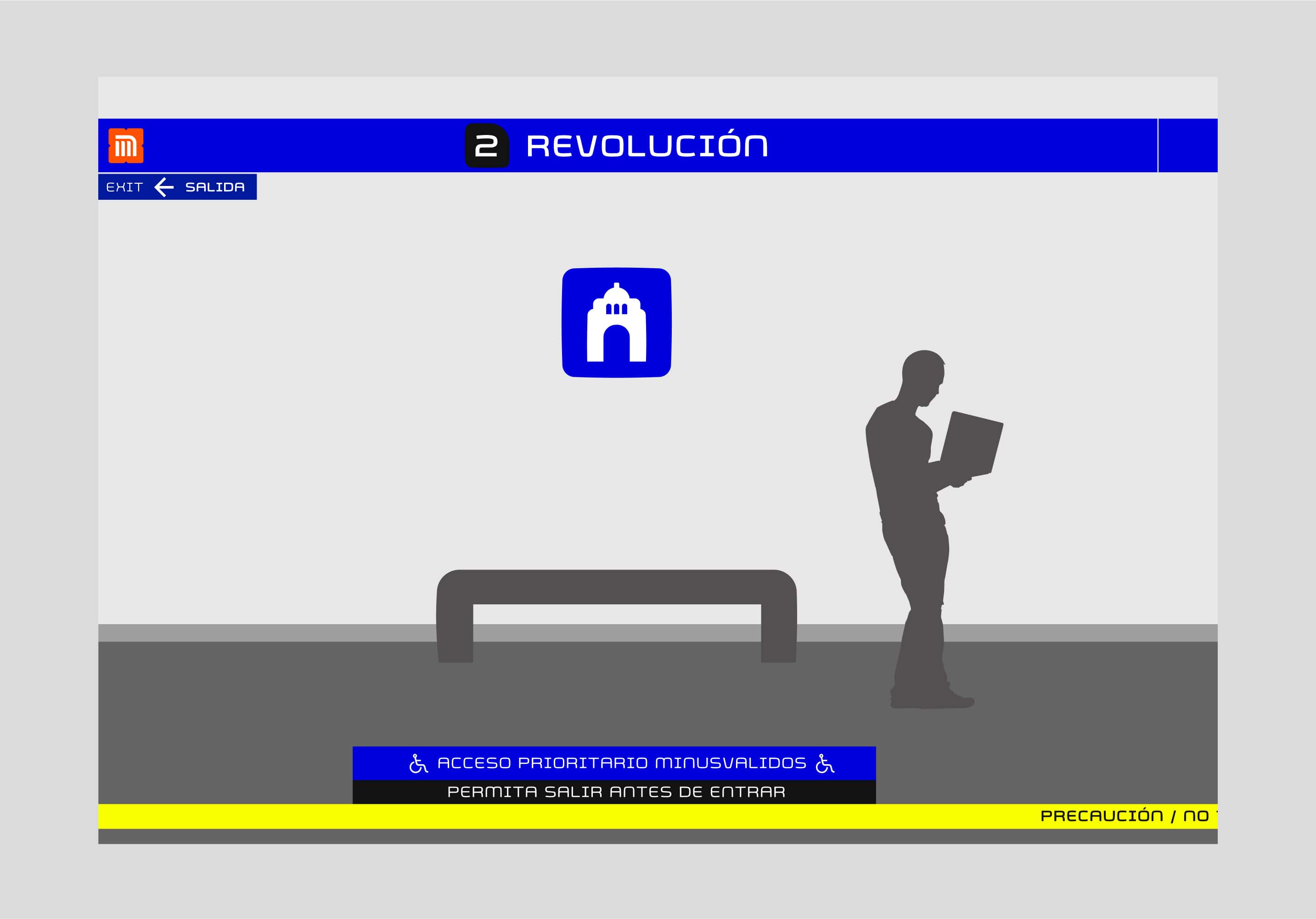
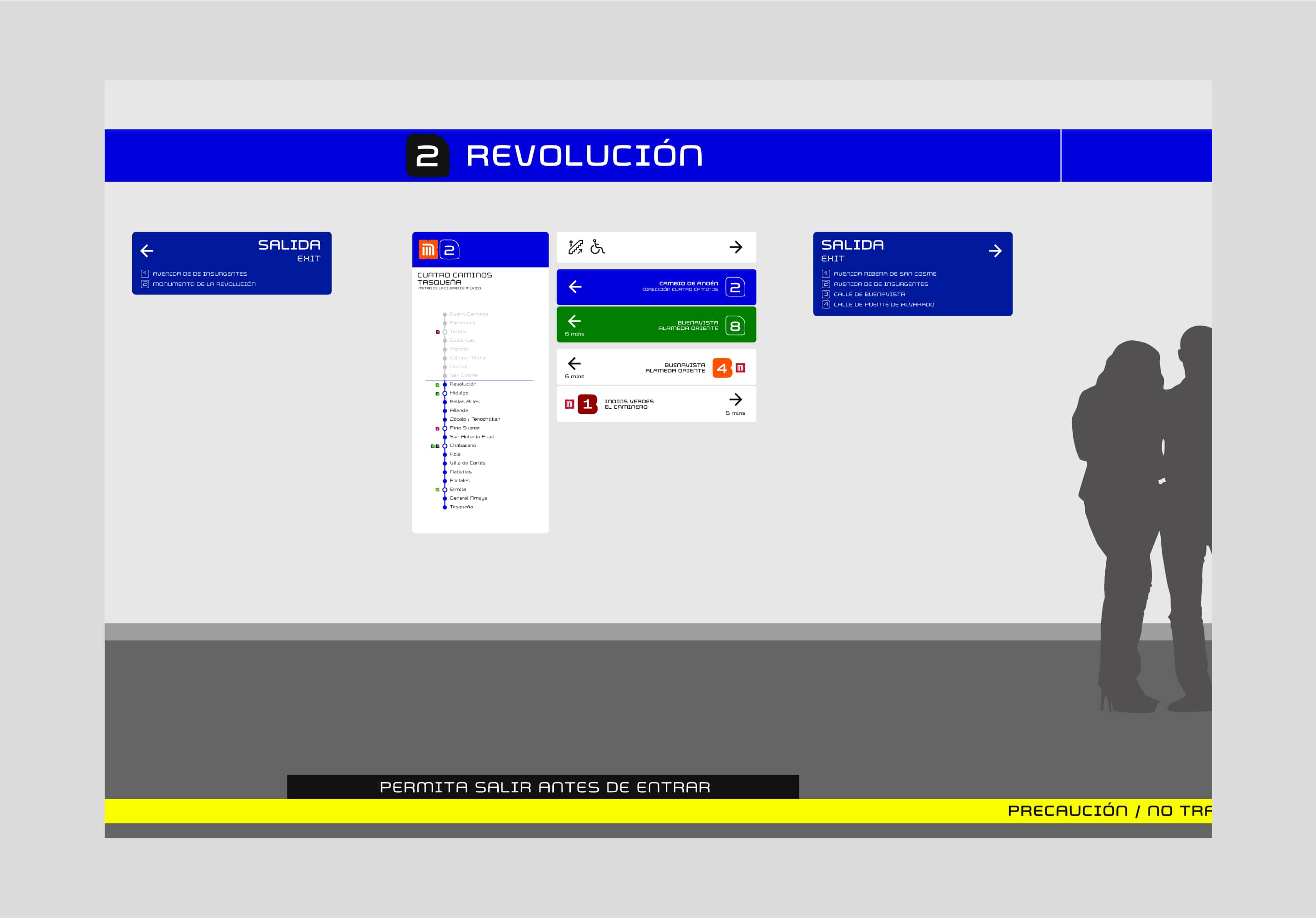
Improving interior and station wayfinding
I worked on creating a grid system that allows defining and building internal wayfinding communications while creating consistency across the brand identity system and the station's visual elements.
Defining a system to help navigate the interior more efficiently
We worked on creating new ways and resources to help people to make decisions about how to navigate the spaces.
Expanding the brand to work as a communicative element
As a new potential option, and leveraging on the iconic character of the icons we thought we could create branding elements and merchandise elements that could help Metro to communicate and elevate the brand perception.